

|
|
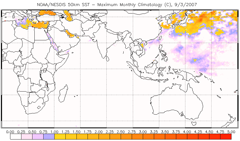
Coral Reef Watch's 50km Coral Bleaching HotSpot product highlights those areas around the world where the SST is above the maximum monthly mean (MMM) observed by NOAA's polar-orbiting satellites. All white areas in the ocean are at or below the MMM temperature. Light purple means that the SST is above the MMM but still below the bleaching threshold. Yellow to red regions are at or above the bleaching threshold (HotSpot ≥ 1°C), and corals in those areas are experiencing heat stress that leads to bleaching. The values show the number of degrees Celsius above the MMM. Coral Bleaching HotSpot information is available for all 50km Virtual Station sites using the time series graphs. A HotSpot is identified any time the SST goes above the MMM (dashed light-blue line). An example HotSpot is highlighted in orange below: 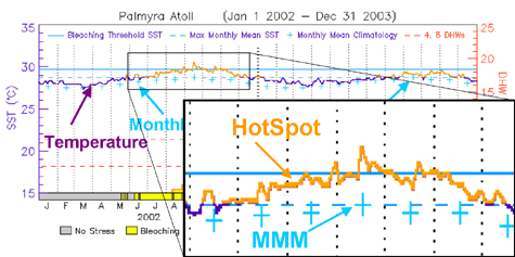
The HotSpot concept was developed based on earlier work by Goreau & Hayes (1994) and Montgomery & Strong (1995).
|
|
|||||||||||||||
|
|
|||||||||||||||||
|
IMPORTANT USER ALERT (2 July 2024): This past weekend, a storage server at NOAA's Center for Satellite Applications and Research, which delivers the NOAA Coral Reef Watch data, suffered a hardware failure. The issue is being addressed, and we hope to have the NOAA Coral Reef Watch data back up and running as soon as possible. (1) The most recent data will be made available first; historical data may take time to be restored. (2) If you need specific data that are not yet available, please contact us at coralreefwatch@noaa.gov. (3) If you use code to pull data, please revise your code to use “…/socd/…” in lieu of “…/sod/…” in all relevant web addresses for all future needs. We apologize for any inconvenience this may cause. |