

|
|
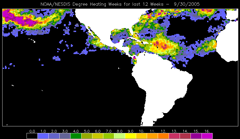
Earlier in this tutorial, you learned that corals are sensitive to temperatures warmer than the bleaching threshold, i.e., 1°C above the highest summertime mean SST. You also learned that Coral Reef Watch's (CRW) 50km Coral Bleaching HotSpot product provides a snapshot of where corals are stressed right now around the globe from heat stress. Remember though that heat stress will build up if the temperature around the corals stays above the bleaching threshold over time. We need some way to measure not only how far the temperature is above the threshold, but how long it has stayed above that point. This is what the 50km Degree Heating Week (DHW) product was designed to portray. As with the other 50km products in this tutorial, the 50km DHW, prior to its retirement on April 30, 2020, was updated twice per week. The DHW shows how much heat stress has accumulated in an area over the past 12 weeks (3 months). In other words, we add up the Coral Bleaching HotSpot values whenever the temperature exceeds the bleaching threshold. It is a running sum: as we advance one half-week in time (a time step), a half-week time step "falls off" the back end of the 12-week window. Areas shown in black in the ocean have not accumulated heat stress over the previous 3 months; i.e., the temperature had not crossed the local bleaching threshold. Any colored regions indicate accumulated heat stress to corals in those areas. The units for DHW are "degree C-weeks", combining the intensity and duration of heat stress into one single number. Based on research at CRW, when the heat stress reaches four degree C-weeks, you can expect to see significant coral bleaching, especially in more sensitive species. When heat stress reaches eight degree C-weeks or higher, you would likely see severe, widespread bleaching and significant mortality. The 50km DHW history is also shown on the time series graph for each 50km Virtual Station site. If you follow the 50km SST line, you can look for times when it touches or exceeds the bleaching threshold temperature. The areas highlighted in red below are added up to make the 50km DHW: 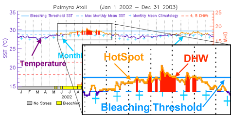
In the graph below, you can see that the 50km DHWs are also plotted in a separate section along the bottom of the graph, with the scale on the right-hand axis. The 4- and 8-DHW thresholds are shown as dashed, horizontal red lines. The colors that fill below the DHW line correspond to established satellite bleaching alert levels, which are discussed in the next section. 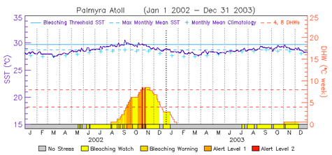
|
|
|||||||||||||||
|
|
|||||||||||||||||
|
IMPORTANT USER ALERT (2 July 2024): This past weekend, a storage server at NOAA's Center for Satellite Applications and Research, which delivers the NOAA Coral Reef Watch data, suffered a hardware failure. The issue is being addressed, and we hope to have the NOAA Coral Reef Watch data back up and running as soon as possible. (1) The most recent data will be made available first; historical data may take time to be restored. (2) If you need specific data that are not yet available, please contact us at coralreefwatch@noaa.gov. (3) If you use code to pull data, please revise your code to use “…/socd/…” in lieu of “…/sod/…” in all relevant web addresses for all future needs. We apologize for any inconvenience this may cause. |