

|
|
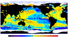
To calculate the Sea Surface Temperature (SST) Anomaly, we first needed to know the long-term mean SSTs globally. We took almost 10 years of NOAA polar-orbiting satellite SST measurements and calculated the mean SSTs in each month for every ocean pixel around the world. These monthly means are called the SST "climatology" and are available on our website. We use the SST climatology to calculate the twice-weekly 50km SST Anomaly product, which identifies where the SST is different from the normal conditions for that day of the year. An example of our 50km SST Anomaly product is shown at the top-right of this page. Areas in purple to blue mean a negative anomaly; that is, the water temperature is cooler than the mean. Orange to red means a positive anomaly: the temperature is warmer than the mean. The values range from -5 to 5°C. Just like the 50km SST product, this 50km SST Anomaly has a half-degree spatial resolution (~50km) and was updated in near real-time, twice per week, prior to its retirement in April 2020. The time series graphs for our 50km Virtual Stations also give an indication of whether the SST is above or below the mean, as you will see in this example from the Seychelles: 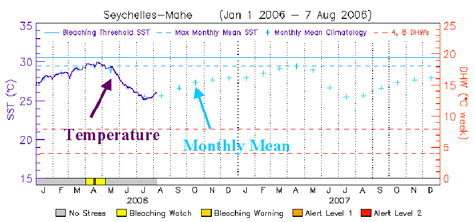
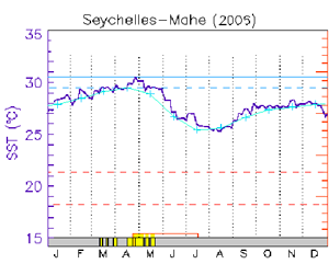
Remembering that the current 50km SST is shown as a dark blue solid line, you can see that each month's mean temperature for that location is also on the graph as light blue crosses. The months are shown along the bottom of the graph. At this reef location in the Seychelles, the mean 50km SST observed by satellite is highest in April (about 29.5°C) and lowest in July (about 25°C). Between April and July 2006, you can see that the 50km SSTs in the Seychelles were very close to the long-term monthly means.
Let's look at what happened in 2005 for that same coral reef location (graph on right). Look at the 50km satellite SST in dark blue from mid-April until the end of July and compare to the long-term monthly means in light blue. You can see that the 50km SSTs were consistently above the monthly mean temperatures (positive anomalies) for the entire period.
|
|
||||||||||||||||||||
|
|
||||||||||||||||||||||