


|
|
NOAA CRW's daily global 5km satellite Coral Bleaching HotSpot product measures the occurrence and magnitude of the instantaneous heat stress that causes coral bleaching. It is a type of anomaly product but is different from the daily global 5km satellite Sea Surface Temperature (SST) Anomaly that you learned about earlier in this tutorial. This is because the Coral Bleaching HotSpot product is designed to highlight those areas around the world, where the SST is above the Maximum Monthly Mean (MMM) temperature for that location. In the example daily global 5km satellite Coral Bleaching HotSpot product map displayed on the right, all light blue areas in the ocean are below the MMM temperature. HotSpots in shades of purple indicate the SST is above the MMM, but still below the bleaching threshold. Areas of the ocean that are colored yellow to dark red/brown are at or above the bleaching threshold (i.e., Coral Bleaching HotSpot ≥ 1 °C). The dramatic change in the color scheme at 1 °C is designed to highlight those areas of the world, where corals are experiencing the severe heat stress that can lead to bleaching. The Coral Bleaching HotSpot value shows the number of degrees Celsius that the SST is above the MMM. Data and images are available for free on the CRW website at https://coralreefwatch.noaa.gov/product/5km/index.php. Let’s look again at the example two-year (2019-2020) time series graph for the Main Hawaiian Islands 5km Regional Virtual Station, so we can better visualize the Coral Bleaching HotSpot concept with data. In the graph below, a HotSpot is identified any time the SST (dark bluish-purple solid line) goes above the MMM (light blue, horizontal dashed line), as shown in the magnified box. 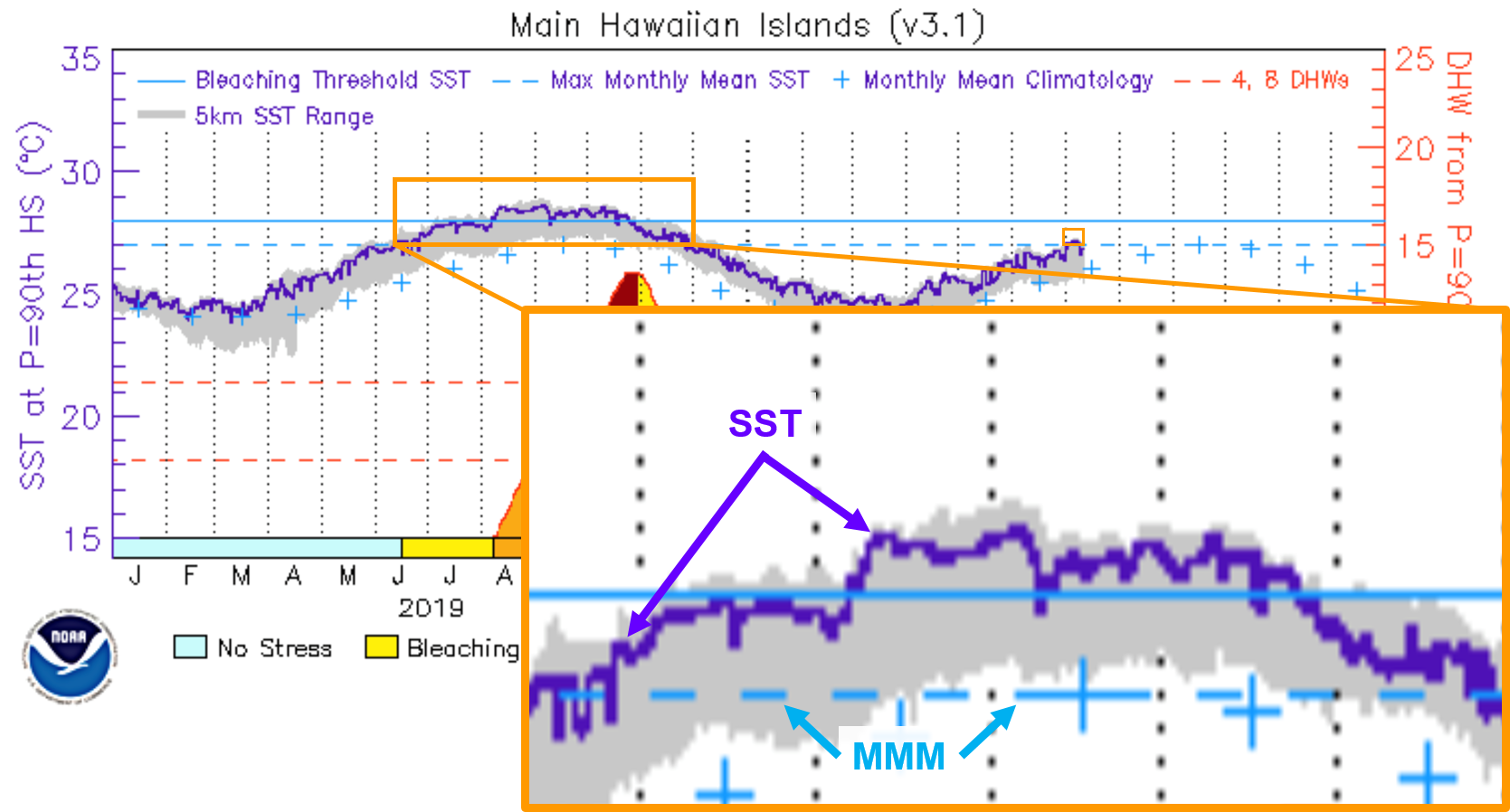
NOAA CRW developed the Coral Bleaching HotSpot concept based on work by Goreau and Hayes (1994) and Montgomery and Strong (1994).
|
|||||||||||||||
|
|
||||||||||||||||


